LLM Observability with the Best UI: A 2026 Engineer's Guide

LLM observability is defined as the practice of capturing, visualizing, and analyzing traces, metrics, and evaluation signals from large language model pipelines to diagnose failures, track costs, and maintain quality at scale. The quality of the user interface you use to access that data is not a secondary concern. It is the difference between spotting a latency regression in two minutes and spending two hours chasing phantom logs. Tools like MLflow, Langfuse, and Grafana each take a different approach to LLM performance visualization, and the gaps between them are significant enough to affect your team's debugging velocity in production.
What features constitute the best UI for LLM observability?
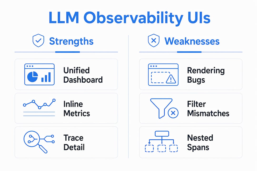
The best UI for LLM monitoring combines four capabilities: nested span visualization, interactive filtering, real-time metrics dashboards, and cost-quality correlation within a single view. Each of these features addresses a distinct failure mode that engineers encounter when operating LLM pipelines at scale.
Here is what separates a genuinely useful observability UI from one that merely looks polished:
- Trace explorer with nested span visualization. Agent pipelines generate deeply nested call trees. A UI that flattens those trees or fails to render expand/collapse interactions correctly destroys debugging speed. Virtualized trace tree UIs require thorough testing with nested tool call patterns to avoid silent bugs that degrade debugging speed despite static views appearing correct.
- Interactive filtering that respects context. Filtering by environment, user ID, or session must cascade correctly across all dependent selectors. A confirmed filtering bug in Langfuse shows that when environment filters are applied, the user ID dropdown does not update to reflect only users with traces in that environment. That kind of mismatch erodes trust in the data.
- Real-time metrics dashboards. Latency, throughput, time-to-first-token, and error rates need live visualization. Prometheus-compatible metrics displayed via Grafana represent a proven pattern for real-time debugging and performance monitoring in LLM deployments.
- Cost attribution and quality metadata correlation. The hallmark of a best UI is correct latency attribution combined with cost and quality metadata correlation within trace views, using OpenTelemetry GenAI semantic conventions to attach token and cost signals directly to LLM operations.
- Rendering correctness under load. A UI that looks correct with five spans may break with fifty. Smooth rendering under complex trace expansions is a non-negotiable requirement, not a nice-to-have.
Pro Tip: Before committing to any trace explorer, run it against a real agent trace with at least three levels of nesting and ten or more tool calls. Rapidly expand and collapse spans to surface virtualized rendering defects that only appear under interaction stress.
How MLflow's dashboard elevates LLM observability UI

MLflow's agent observability dashboard is the most complete single-pane view available for LLM and agent monitoring in 2026. It was purpose-built for the specific demands of agentic reasoning traces, not retrofitted from a generic APM tool.
The dashboard surfaces several capabilities that matter to production AI teams:
- Unified trace and metrics view. MLflow combines span-based trace inspection with Prometheus-style metric tracking in one interface. You do not need to context-switch between a trace explorer and a separate Grafana board to correlate a latency spike with a specific tool call.
- Agent-specific span breakdown. The dashboard renders sub-agent calls, tool invocations, retrieval steps, and LLM completions as distinct, labeled spans. Each span carries token counts, latency, and cost metadata inline, so you can identify which step in a multi-agent chain is responsible for a cost overrun without writing a single query.
- Interactive drill-downs. Clicking into any span opens a detail panel showing the full prompt, completion, model parameters, and evaluation scores side by side. This is the kind of interaction that turns a five-minute debugging session into a thirty-second one.
- LLM-as-a-Judge score integration. MLflow's dashboard surfaces automated evaluation scores directly alongside trace data. Quality regressions appear in the same view as latency and cost signals, which means you catch model degradation before users report it.
- Stability under complex traces. Unlike tools that suffer from nested span rendering bugs causing overlapping UI elements, MLflow's trace tree renders correctly across deeply nested agentic workflows.
Combining span-based debugging UIs with metrics dashboards addresses both why issues occur and how widespread regressions are. MLflow's dashboard executes that combination natively, without requiring you to stitch together separate tools.
How do leading LLM observability UIs compare?
The table below summarizes the UI strengths and documented weaknesses of the most widely used LLM observability platforms in 2026.
| Platform | UI strengths | Known UI weaknesses |
|---|---|---|
| MLflow | Unified agent dashboard, inline cost/quality metadata, stable nested span rendering, LLM-as-a-Judge integration | Requires self-hosting for full feature access |
| Langfuse | Interactive trace evaluation, annotation workflows, session grouping | Nested span overlap bug in 2026; environment filter does not cascade to user dropdown |
| Grafana + Prometheus | Mature real-time metrics visualization, alerting, wide plugin ecosystem | No native LLM trace explorer; requires separate tracing backend |
| Helicone | Simple request logging UI, cost tracking per model | Limited span-level debugging; no agent-aware trace tree |
| WhyLabs | Data drift and quality monitoring dashboards | Weaker trace-level debugging; less suited for agentic workflows |
A few observations worth calling out. Langfuse's trace-detail UI offers interactive evaluation but suffers from nested span rendering bugs that cause overlapping and unusable trace trees, with a known workaround involving legacy renderer use. That is a meaningful productivity tax for teams debugging complex agent chains. Grafana excels at metrics visualization but requires a separate tracing backend, which means you are maintaining two systems and manually correlating signals across them.
MLflow's advantage is not that it does one thing exceptionally well. It is that it does all of these things in a single, stable interface designed specifically for LLM and agent workflows. For teams running production LLM and agent observability, that integration eliminates an entire category of operational overhead.
Pro Tip: When evaluating any LLM observability UI, check the project's GitHub issues for rendering and filtering bugs before committing. UI defects in trace explorers are often underreported because they only surface under specific interaction patterns.
What are the best practices for LLM observability UI?
Maximizing the value of your observability UI requires more than picking the right tool. The following practices apply regardless of which platform you use, and they become especially important as your agent pipelines grow in complexity.
-
Adopt OpenTelemetry GenAI semantic conventions. Standardizing on OTel GenAI conventions means your trace data carries consistent attribute names across every tool in your stack. The genainormalizerprocessor in the OpenTelemetry Collector maps attributes from OpenInference and OpenLLMetry to these conventions, giving you UI portability without rewriting your instrumentation.
-
Use collector-side normalization before data reaches the UI. Normalizing telemetry at the collector layer means your observability UI always receives clean, consistently labeled data. This prevents the attribute name mismatches that cause missing spans or broken filters in the frontend.
-
Combine trace explorers with metrics dashboards. Span-based debugging tells you why a specific request failed. Metrics dashboards tell you how often that failure is occurring across your fleet. Combining these two views creates a complete picture of both individual incidents and systemic regressions.
-
Verify filtering functionality before trusting the data. UI filtering must be comprehensive, ensuring every filter dimension constrains both trace lists and dependent selectors. Run a manual check: apply an environment filter and confirm that every downstream dropdown, including user IDs and session IDs, updates to reflect only data from that environment.
-
Set proactive alerts on latency, cost, and quality thresholds. Do not wait for users to report problems. Configure your metrics dashboard to alert when time-to-first-token exceeds your SLA, when per-request token cost spikes above baseline, or when LLM-as-a-Judge scores drop below your quality floor.
-
Test your UI under realistic trace complexity. Run your trace explorer against the most complex agent trace your system produces. Expand every span, apply every filter combination, and verify that the UI renders correctly. Silent rendering defects only appear under specific interaction patterns, and discovering them in production is far more costly than finding them in a pre-deployment review.
Key takeaways
Effective LLM observability with the best UI requires a stable, unified interface that connects span-level trace data, real-time metrics, and quality evaluation signals in a single, correctly rendering view.
| Point | Details |
|---|---|
| UI correctness is non-negotiable | Nested span rendering bugs and filter mismatches directly reduce debugging speed and data trust. |
| Unified dashboards outperform stitched tools | Combining trace explorers and metrics dashboards in one interface eliminates cross-tool correlation overhead. |
| OTel normalization improves UI consistency | Collector-side attribute normalization ensures clean, consistent data reaches every observability UI. |
| MLflow leads on agent-aware UI | MLflow's agent dashboard renders sub-agent spans, inline costs, and LLM-as-a-Judge scores in a single stable view. |
| Proactive alerting requires metrics integration | Latency, cost, and quality alerts only work when your UI connects span data to real-time metric streams. |
Why UI quality in LLM observability deserves more attention than it gets
Most conversations about LLM observability focus on what data to collect. Fewer focus on whether the interface you use to view that data actually works correctly under the conditions you will encounter in production. That gap is where teams lose hours they cannot afford to lose.
I have seen engineers spend significant time debugging what turned out to be a UI rendering artifact rather than an actual model failure. The trace tree looked wrong because the frontend was broken, not because the pipeline was. That kind of false alarm is expensive, and it is entirely preventable if you treat UI correctness as a first-class requirement from the start.
MLflow's approach to this problem is the right one. The agent dashboard was designed with the specific interaction patterns of agentic workflows in mind: deep nesting, multi-step tool chains, parallel sub-agent calls. It does not just display traces. It renders them correctly, consistently, and with the metadata you need to act on what you see. The integration of LLM-as-a-Judge scores directly into the trace view is a detail that sounds minor until you realize it eliminates an entire tab-switching workflow from your debugging routine.
The platforms that treat UI as a secondary concern tend to accumulate a long tail of GitHub issues that individually seem minor but collectively make the tool unreliable for serious production use. Filtering bugs, rendering overlaps, and stale dropdowns are not cosmetic problems. They are correctness problems. Any tool you use for LLM observability should be held to the same correctness standard as the models it monitors.
My recommendation: treat your observability UI as part of your production infrastructure. Test it, maintain it, and upgrade it with the same rigor you apply to your model serving stack.
— Kevin
See MLflow's LLM observability dashboard in action
MLflow delivers production-grade LLM observability through a purpose-built agent dashboard that unifies trace inspection, real-time metrics, and automated evaluation in a single, stable interface.
The MLflow AI observability platform gives your team span-level debugging with inline cost and quality metadata, correct nested trace rendering, and LLM-as-a-Judge score integration out of the box. Whether you are monitoring a single model endpoint or a multi-agent pipeline with dozens of tool calls, MLflow's agent and LLM engineering platform scales with your architecture. Explore the dashboard and connect your first LLM trace in minutes.
FAQ
What is LLM observability with the best UI?
LLM observability with the best UI is the combination of a stable trace explorer, real-time metrics dashboards, and correctly functioning filters that give engineers full visibility into LLM pipeline performance, cost, and quality from a single interface.
Why does UI quality matter for LLM monitoring?
UI defects like nested span rendering bugs and filter mismatches cause engineers to misread trace data or spend time debugging the tool instead of the model. Correct, stable rendering is a functional requirement for reliable observability.
How does MLflow's dashboard improve LLM trace analysis?
MLflow's agent dashboard renders sub-agent calls, tool invocations, and LLM completions as labeled spans with inline token counts, latency, and LLM-as-a-Judge scores, enabling engineers to identify cost and quality issues without switching between multiple tools.
What is the role of OpenTelemetry in LLM observability UIs?
OpenTelemetry GenAI semantic conventions standardize attribute names across LLM telemetry, and collector-side normalization processors map diverse instrumentation formats to those conventions, ensuring consistent and accurate data display in any observability UI.
How do I test an LLM observability UI before adopting it?
Run the trace explorer against a real agent trace with at least three levels of nesting, rapidly expand and collapse spans, apply environment and user filters, and verify that all dependent selectors update correctly. These interaction patterns surface the rendering and filtering bugs most likely to affect production debugging.